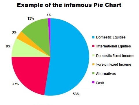
Don’t Trust a Pie Chart to Test Investment Diversification
“What is your current strategy to help mitigate investment losses?”
“Can you show me some specific examples of diversity within your portfolio?”
“What is the maximum loss of money you can tolerate at this point in your life?”
These are just a few examples of how I learn about potential client priorities as well as the missing elements in their existing plans. Most investors point to a “pie chart” found on the first few pages of their quarterly statements. Sometimes they have several statements from several different companies, each with their own pie chart.
The Pie Chart Problem
What do all those slices of pie really mean? Do more pies, and more slices, imply greater diversity?
It is important to understand that diversification isn’t designed to boost returns. Unfortunately, for many investors, the pie chart can be misleading. The goal of “diversification” is to select different asset classes whose returns haven’t historically moved in the same direction and to the same degree; and, ideally, assets whose returns typically move in opposite directions. This way, even if a portion of your portfolio is declining, the rest of your portfolio is more likely to be growing, or at least not declining as much. Thus, you can potentially offset some of the impact that a poorly performing asset class can have on an overall portfolio. Another way to describe true diversification is correlation. We want to own asset classes that are not directly correlated.
Unfortunately, even though a pie chart may make it look like an investor is safely diversified, it’s probably not the case. They are probably much more correlated to the market than they realize. Making matters worse, investors with multiple different families of mutual funds often own the exact same companies across the different families. We call this phenomenon “stock overlap” or “stock intersection.” You may own 10 different mutual funds, but the largest holdings in each fund are the same companies.
There was a fascinating study done in the late 1970s by Elton and Gruber. They concluded that a portfolio’s diversity stopped improving once you had more than 30 different securities. In other words, increasing from one or two securities up to 30 had a big improvement. Increasing from 30 all the way up to 1,000 different securities didn’t materially improve the portfolio’s diversity.
Consider that the next time you open up your quarterly statement. How many mutual funds do you really own? How many individual stocks are inside all of those mutual funds?
How about overseas? Again, Morningstar data shows that back in the 1980s there was a low correlation (0.47) between U.S. equities and international equities. That correlation has steadily increased to 0.54 in the 1990s all the way up to 0.88 in the 2000s.
The biggest challenge for most investors is finding an adviser with extensive experience. If your portfolio is market based, and you are hoping your “pie chart” is going to save the day, now is not the time to be complacent. Dedicate some time and meet with one of our independent financial advisors with experience working with all asset classes.